In the world of data visualization, the design of your chart can completely change how your audience interprets information. A poor visualization choice can lead to misinterpretation, data bias, or even loss of credibility.
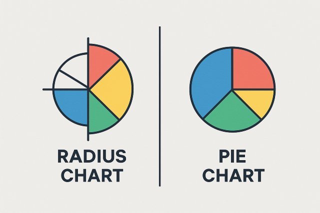
Among the many chart types available, two often compared are the radius chart and the pie chart. Though similar in appearance, these two serve distinct purposes and communicate data differently.
In this article, we’ll explore the key differences between a radius chart and a pie chart, understand their ideal use cases, analyze their strengths and limitations, and give you actionable tips to decide which is best for your data story.
What Is a Pie Chart?
A pie chart is one of the most recognized forms of data visualization. It divides a circle into slices to represent numerical proportions. Each slice’s angle corresponds to a data category’s contribution to the total.
Example:
Imagine a company with a $100,000 marketing budget divided among four channels: SEO (40%), social media (25%), paid ads (20%), and email (15%). A pie chart visually communicates these proportions in a simple, intuitive way.
How a Pie Chart Works
- The total of all slices represents 100%.
- Each slice’s central angle is proportional to its value.
- The sum of all slice angles equals 360°.
For example, in our budget breakdown:
- SEO = 40% → 0.40 × 360° = 144°
- Social Media = 25% → 0.25 × 360° = 90°
- Paid Ads = 20% → 0.20 × 360° = 72°
- Email = 15% → 0.15 × 360° = 54°
Visually, this makes it easy to compare relative proportions at a glance.
What Is a Radius Chart (Polar Area Chart)?
A radius chart sometimes called a polar area chart, coxcomb chart, or rose chart — expands upon the pie chart concept. While a pie chart uses only angles to represent values, a radius chart uses both radius and area.
How a Radius Chart Works
- Each segment extends outward from the center.
- Both angle and radius encode information.
- The area of each segment represents the magnitude of data.
Because the radius affects area quadratically, even small radius differences can represent large changes in data magnitude. This makes the radius chart particularly effective for datasets where variations in scale are important.
Historical Note:
The radius chart was famously popularized by Florence Nightingale in the 1850s to depict causes of death during the Crimean War. Her visualization dramatically highlighted preventable deaths, influencing healthcare reforms.
Visual Example: Radius Chart vs Pie Chart
Alt text: radius chart comparing monthly sales to pie chart proportions.
In the above comparison:
- The pie chart only shows what percentage each month contributes to total sales.
- The radius chart reveals the relative intensity of each month’s performance — showing which months not only had a larger share, but also higher magnitudes.
Radius Chart vs Pie Chart: Key Differences
Let’s break down their core distinctions across several dimensions.
| Feature | Pie Chart | Radius Chart (Polar Area Chart) |
|---|---|---|
| Data Representation | Uses angle to show proportions. | Uses angle + radius to represent both proportion and magnitude. |
| Primary Purpose | Illustrate parts of a whole. | Show changes or magnitudes in circular data. |
| Ideal Dataset Type | Categorical proportions. | Cyclical, magnitude-based, or directional data. |
| Complexity Level | Simple and easy for beginners. | Slightly complex, suited for analysts. |
| Use Cases | Budget splits, market shares, survey results. | Meteorology, performance metrics, circular patterns. |
| Interpretation | Slice size = category share. | Area coverage = category magnitude. |
| Visual Focus | Equal radius, focus on angle. | Variable radius, focus on area. |
When to Use a Pie Chart
1. Showing Simple Proportions
Pie charts shine when you need to communicate percent-based data for a few categories.
Example:
Visualizing how total revenue is distributed among three product lines.
2. When Your Audience Is Non-Technical
Pie charts are easy to understand, even for those without a data background.
3. When Comparing Limited Categories
Stick to 5 or fewer slices to maintain clarity. More slices reduce readability.
4. For Quick Data Snapshots
They are great for presentations, dashboards, and infographics where simplicity trumps precision.
When to Use a Radius Chart
1. Displaying Cyclical or Time-Based Data
Radius charts excel when your data repeats cyclically — monthly, hourly, or seasonally.
Example: Average monthly temperature or wind speed.
2. Showing Magnitude Differences
When categories differ significantly in scale, a radius chart’s area variation makes those differences visually clear.
3. Visualizing Circular Relationships
Ideal for polar coordinates, like directions, compass data, or circular frequency patterns.
4. Creating Visually Engaging Infographics
A well-designed radius chart adds visual appeal while maintaining depth and meaning.
Advantages and Disadvantages
Pie Chart Advantages
- Universally recognized and easy to grasp.
- Excellent for showing part-to-whole relationships.
- Visually simple and uncluttered.
Pie Chart Disadvantages
- Difficult to compare similar-sized slices.
- Not scalable for datasets with many categories.
- Lacks the ability to show changes in magnitude.
Radius Chart Advantages
- Conveys both magnitude and directional patterns.
- Ideal for time-based or cyclical trends.
- Visually compelling; draws audience attention.
Radius Chart Disadvantages
- Requires more explanation to interpret.
- Can mislead if radius scaling isn’t linear.
- Not ideal for simple part-to-whole visuals.
Real-World Examples
1. Business Analytics
- Pie Chart: Visualize customer distribution across regions.
- Radius Chart: Show monthly sales trends over a year, highlighting seasonality.
2. Meteorology
- Pie Chart: Display weather condition proportions (sunny, rainy, cloudy).
- Radius Chart: Map wind speeds by direction to identify dominant wind patterns.
3. Healthcare
- Pie Chart: Show hospital expense categories.
- Radius Chart: Analyze patient admission rates by month or disease category magnitude.
4. Marketing
- Pie Chart: Share of traffic from different sources (organic, paid, referral).
- Radius Chart: Track ad performance fluctuations over time.
Designing an Effective Radius Chart
Creating a meaningful radius chart involves more than just plotting data.
Follow these best practices to make your visualization accurate and engaging.
1. Keep Data Normalized
Ensure all radius values are scaled proportionally to avoid visual distortion.
2. Limit Categories
Too many segments make it unreadable. Stick to 8–12 maximum for time-based datasets.
3. Use Consistent Colors
Assign consistent colors across datasets for easier comparison (e.g., same color family for months).
4. Label Clearly
Always include legends, annotations, or interactive hover labels to improve comprehension.
5. Use Transparency and Gridlines
Subtle gridlines help audiences perceive magnitude correctly, especially when radius differences are small.
6. Validate with Stakeholders
Before finalizing, test your chart with intended viewers — what’s intuitive to you may not be to others.
Common Mistakes to Avoid
- Overcrowding the chart with too many segments.
- Using 3D effects that distort perception.
- Inconsistent scaling of radius values.
- Poor color contrast leading to confusion.
- Ignoring legends or failing to label properly.
Tools to Create Radius and Pie Charts
| Tool | Supports Pie Chart | Supports Radius Chart | Best For |
|---|---|---|---|
| Microsoft Excel | ✅ | ✅ (Radar/Polar charts) | Beginners |
| Tableau | ✅ | ✅ | Business Dashboards |
| Power BI | ✅ | ✅ | Interactive analytics |
| Google Charts | ✅ | ✅ | Web visualizations |
| Python (Matplotlib, Plotly) | ✅ | ✅ | Data science and automation |
| R (ggplot2) | ✅ | ✅ | Statistical visualization |
Radius Chart vs Pie Chart: Which Should You Use?
Here’s a simple decision guide:
| Goal | Recommended Chart | Reason |
|---|---|---|
| Show proportional data | Pie Chart | Clear, simple representation. |
| Highlight variations in magnitude | Radius Chart | Displays differences more effectively. |
| Present cyclical data (e.g., seasons, months) | Radius Chart | Natural fit for circular timelines. |
| Communicate quickly to a general audience | Pie Chart | Easy for non-technical users. |
| Analyze performance trends | Radius Chart | Adds depth and insight. |
FAQ: Radius Chart vs Pie Chart
1. Is a radius chart better than a pie chart?
Not necessarily — they serve different purposes. A radius chart is ideal for magnitude and cyclical data, while a pie chart is best for simple proportions.
2. Can I use a radius chart to show percentages?
Yes, but interpret carefully. Because area grows exponentially with radius, percentages can appear exaggerated if not scaled correctly.
3. What’s the difference between a radius chart and a radar chart?
A radar chart connects data points on axes radiating from a center, forming a polygon. A radius chart uses filled areas (segments) to represent magnitudes.
4. Are radius charts suitable for presentations?
Absolutely — they’re visually striking and useful for storytelling, but make sure to include legends and clear explanations.
5. Which chart is best for beginners?
A pie chart is easier for general audiences. Start there before experimenting with advanced types like the radius chart.
Advanced Tip: Combining Both Charts
For powerful insights, you can combine both charts in one dashboard:
- Use a pie chart to show the overall share.
- Use a radius chart alongside it to show intensity or trend within each category.
This dual visualization offers both clarity and depth, appealing to technical and non-technical audiences alike.
Conclusion: Radius Chart vs Pie Chart — Make the Right Choice
Both radius charts and pie charts are valuable tools in your visualization toolkit, but the best choice depends on your goal.
- Use a pie chart for simplicity, clarity, and quick comparisons.
- Use a radius chart when you need to express magnitude, direction, or cyclical data trends.
By understanding their strengths and limitations, you’ll be better equipped to create visuals that not only inform but also inspire confidence in your data storytelling.